You know the story… you’ve split tested, reworked, and tweaked your paid ads and still have nothing to show for it.
We’ve all been there.
But one thing we often forget about when we’re testing campaigns is our ad scent.
I’m not talking about scratch-and-sniff stickers here; I’m talking about the trail a customer follows, starting with a paid ad and leading to your website, all with the goal of taking them through the customer journey.
Marketing That Stinks
One of the most frustrating experiences as a consumer is when you click on a link and you’re thrown off the scent because the link you clicked sent you to a seemingly—or completely—unrelated page.
Stinks, doesn’t it? 
Well, it doesn’t convert well either. The “scent” from what was promised to what is delivered is so incongruent that virtually every visitor will bounce immediately.
Let’s be honest, though, nearly every “path” on the web could stand to improve its ad scent.
But What Even is Ad Scent?
Ad scent is the consistency between an ad and the landing page it sends you to.
When done right, there should be a seamless transition from ad to landing page. If there is any friction, you run the risk of the customer dropping out of the process.
Take this Stitch Fix ad as an example, which shows jeans, specifically “the best-fitting jeans.”
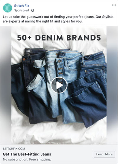
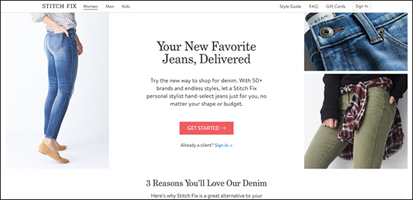
This ad sends you to this landing page, all about “your new favorite jeans.” They even maintain the “50+ brands” messaging.
The landing page feels and looks just like the ad, and customers get exactly what they clicked to find: jeans.
The key to getting ad scent right is to understand the importance of maintaining the scent for these 3 major elements:
- Design/Imagery
- Benefits
- Offer
Design/Imagery Scent
Design is one of the most important aspects of ad scent because without cohesive imagery from an ad to your site, it’s easy to confuse someone. And as a consumer, you need to know you’re taking the right steps to find your desired end result.
Consider keeping the following elements in your design consistent along your path:
- Color scheme
- Layout
- Imagery
- Font Selection/Size/Color
(RELATED: How to Design Facebook Ad Images Like a Pro (…When You’re Really an Amateur))
Here’s a path from Parachute with good design scent. This is a Facebook ad leading to a landing page.
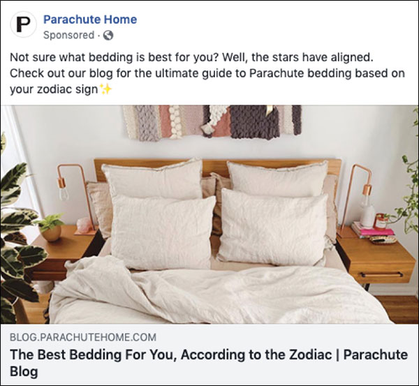
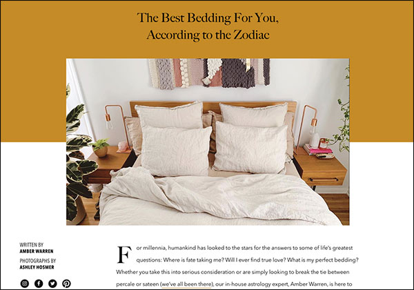
Right off the bat, Parachute drives you to a blog post on the same topic as the ad. They also used the same image as in the ad, so you know that you’re in the right place.
They also keep a consistent color scheme throughout the blog—the gold color transfers from the headline down through the color of the links within the text, giving you a consistent scent throughout your entire experience.
(NOTE: Not sure where to get started on your own Facebook ads? Download our NEWLY UPDATED Ultimate Facebook Ad Template Library for FREE! You can copy and paste these 7 proven Facebook ad campaigns to create low-cost, high-converting ads on demand. Get them here.)
Benefit Scent
A good example of a benefit scent is a car salesman.
Before I lose you… hear me out.
A good car salesman will listen very carefully to what you say. He’ll study your body language. He’ll try to find out if you’re more interested in horsepower or gas mileage. Luxury or economy? GPS, 4-wheel drive, satellite radio?
Then he’ll craft his pitch around the benefits you care about.
Your ads serve the same purpose. A click on an ad is an indication of interest in that thing, and the ensuing pitch should be consistent with the benefits from that ad.
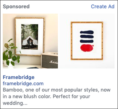
Below you’ll find a Facebook sidebar ad where Framebridge is advertising a bamboo frame for your wedding day pictures:
But when you click:
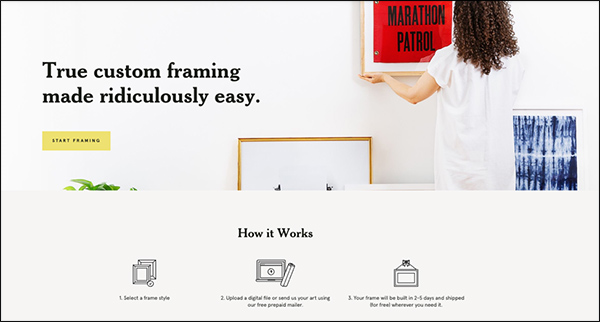
Wait… what?
There’re no bamboo frames on the landing page, and not even anything remotely close to a wedding day photo (aside from the fact that the woman in the photo is wearing white).
Sorry, Framebridge, but this is a poor attempt at a benefit, and, quite frankly, the ad scent is off.
While the ad looks good and the landing page looks good, there’s no sense of continuity between the two. It would (obviously) make more sense to be sent to a landing page that is selling the bamboo frame or a variety of selections popular for wedding photos.
But with neither of those provided, you’re just left with an offer for custom framing, which would probably throw you off the scent based on why you originally clicked.
Offer Scent
It’s surprising how often marketers get this wrong.
If you make an offer in an ad, maintain the scent of that offer from the ad to the landing page. Otherwise, it’s bye-bye traffic.
The easiest way to do this is to use the same language from ad to landing page headline. But it can be done in a subtler manner.
In this PPC ad for the Nomatic Laptop Bag, we find that the same language is used on Google and the video on the landing page. This is a particularly good use of ad scent because you’re enticed to click the video and consume the content immediately to follow the scent.

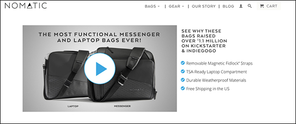
The bullet points on the landing page even describe what is in the description of the ad, which is helpful to drive home the point that you’ve found exactly what you’ve been looking for.
When using the query “hair products,” however, you’ll find that it’s easy to get lost.

What I’m looking for by clicking on the above ad is a product that will create is voluminous hair, right?
I’m thinking some serious Farrah Fawcett hair.
Except, when you click the ad, you get this:
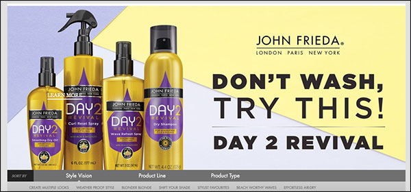
What do dry shampoo products have to do with the ad above?
One of the most important things you need to think about when selling a product is expectation vs. reality. What would someone expect to see vs. what you are actually selling… if there’s a discrepancy, you probably need to fix either the design, benefit, or offer of your ads.
Overall, sometimes you need to stop and smell the ads (that’s the cliché, right?). If something smells a little off, use the tactics above to start to increase conversion rates and get everything flowery fresh once again.
(NOTE: Not sure where to get started on your own Facebook ads? Download our NEWLY UPDATED Ultimate Facebook Ad Template Library for FREE! You can copy and paste these 7 proven Facebook ad campaigns to create low-cost, high-converting ads on demand. Get them here.)
The post Ad Scent: Boost Conversions by Providing a Consistent Ad Experience appeared first on DigitalMarketer.
from Ad Scent: Boost Conversions by Providing a Consistent Ad Experience

No comments:
Post a Comment