You know it and I know it: PowerPoint is boring.
Why? Because the minute we sit down to create a PowerPoint presentation, we forget everything we know about engagement and persuasion.
How do you make a PowerPoint presentation interesting?
It starts with the realization that attention is the only currency that matters. You need to hook your audience’s attention the moment you begin—and you can’t let go for even a second.
Fortunately, it’s not as difficult as you might think. And in this post, I’ll walk you through 7 PowerPoint tips to make your presentations more effective, so you can banish boring presentations forever.
PowerPoint Tip 1: Think Visual
The #1 most common mistake in PowerPoint presentations—and the reason they’re so boring—is that that we create them for us rather than our audience.
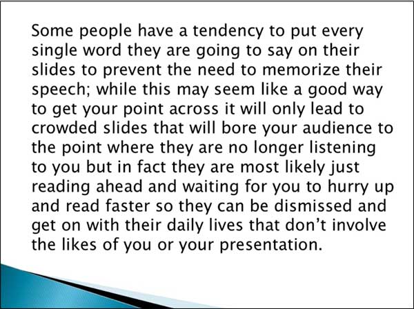
And the temptation is real. If you’re afraid of forgetting an important point, you’ll want to put every word into your slideshow.
But your PowerPoint slides aren’t notecards to keep your presentation on track. They aren’t for you at all. They’re for your audience.
The slides are a supplement to your speech, not a transcript. Their job is to capture your viewers’ attention and clarify your points. And to do that, you need to create a slideshow that’s visual, not textual.
Here is how to make your PowerPoint presentation more visual:
Use text sparingly. You may have a slide with only 1 word, or no words at all. After all, less is more with PowerPoint presentations.
Be liberal with images and graphs. Use them as illustrations for your main points or to add another layer of meaning to your message. And don’t be afraid to let them fill up the screen—with no words at all.
Use videos for pacing and engagement. Videos are especially engaging. They can capture people’s attention at the beginning of your presentation and reengage them after a slow or boring section. They can also be used to transition from one part of your presentation to a dramatically different part, since they create a natural break.
Don’t try to be cute. Visuals should support your presentation. And yes, they may be entertaining, but they should never distract or interfere with the readability of your slides. At all costs, avoid creating slides like this:

Of course, there may be times when visuals won’t work, and that’s okay. In some video sales letters, for example, the words are your visuals.
But even in a purely text-based presentation, you need to think about how it looks. Don’t put too many words on a single slide. Provide lots of white space. Give your audience just one thought at a time, so they stay engaged.
(NOTE: Need a helping hand with your digital marketing efforts? Or maybe you just want proven, actionable marketing tools, tactics, and templates to implement in your business? Check out the latest deal from DigitalMarketer, and you will be on your way to helping your business grow.)
PowerPoint Tip 2: Think “Brand”
Whether it’s your company’s brand or your personal brand, you want to have a recognizable style.
When people see your presentations, they should know it’s yours—because the color and style scream you.
Apple is a good example of this. They’re the masters of “distinctive minimalism,” and everything they do reflects that.
You can pull any 2 slides from their presentations—often even years apart—and they still look like they belong to the same presentation.
Notice the trademark simplicity in this slide from an old Steve Jobs presentation.

And here’s Tim Cook years later. The slides are almost identical.

But how do you make sure you are creating your own well-branded presentation?
Don’t copy other brands’ designs. Your brand should be distinctive. Your presentations should be too. Stick with your brand’s fonts, colors, and unique style.
Design your slides to reflect your brand’s personality. If your brand is bold, go bold in your design. If your brand is understated, go simple. The point is to stay true to your own branded look and feel.
PowerPoint Tip 3: Create a Quality Layout
To create recognizable presentations, you need to develop a high-quality layout that can become your signature style.
A good layout involves everything we’ve talked about so far. It includes the way you come across visually and your branded fonts, colors, and personality. But it’s strategic as well—because you want the layout of every slide to look like you.
To do that, you need to decide in advance how you’re going to handle different design elements, and then stay consistent.
For example, the presentation below could be laid out any number of ways. It could have a traditional layout, like this:

Here, the text primary text box is at the top of each slide, with a secondary text box at the bottom. Images are centered with a yellow border that keeps them from bleeding into the blue background.
But if your brand is more modern, you might choose a more artsy layout, like this:

Now, both of these layouts can work. While most designers would agree the second version is “better,” in reality, the right choice is the one that aligns with your brand and works with the information you’ll be presenting. Here, the image is placed in the background and text is minimized. With this layout, slides are more engaging—less predictable.
What’s more important is that you create a PowerPoint layout that’s attractive to your audience. Then stick with it—don’t jump from one style to another.
And you can do that in several ways:
Use white space to your advantage. White space is the unfilled space between elements on the page (or in this case, the slide). It keeps things from feeling crowded and helps you keep your audience focused on what matters. White space is your friend. Embrace it.
Use animated transitions and multimedia sparingly. Animations can be classy or cheesy—and overdone, they’re usually irritating. An effective use of animation is to show one sentence or bullet point at a time. Avoid garish transitions that could become distracting.
Clip art is almost always a no-no.

Please. No.
Keep your layout simple. Every slide should have just one focal point.
Use gifs sparingly. Movement attracts attention, and gifs move nonstop. The problem is, they can distract people from your main message. So if you use gifs, don’t leave them up while you’re sharing important information. Show them, then move to the next slide while you talk.
PowerPoint Tip 4: Use a Template
Once you’ve settled on a good design for your presentation, turn it into a template. Then create a few variations for the different types of information you’ll present—say, a layout for lists, another for text with an image, and yet another for charts.
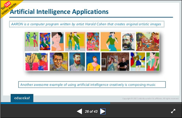
For example, this presentation by Edureka! has 3 primary layouts that keep everything looking consistent.
This is the primary template, which has text above and below a graphic:
This is the template for introducing new subtopics:


And this is the template for discussions, case studies, and examples:
Templates can make your life much easier. Instead of reinventing the wheel every time you need to create a presentation, you can simply pull out your template. With the design work already done, you can focus on the content—so you’re sure your presentation will be interesting.
PowerPoint Tip 5: Create Flow
In a strong presentation, every idea leads to the next. There should be no “stops” or awkward transitions. That’s true for your speech and for your PowerPoint slides.
Every slide should bring your audience closer to your final slide—or call to action.
Of course, flow is nebulous. It’s hard to create it, but easy to spot when it’s missing. While there aren’t many hard-and-fast rules to ensure flow, there are several things you can do to make it easier.
Know your goal. It’s a lot easier to lead people to a place when you know what that place is. Every slide should bring your audience closer to your final slide—or call to action.
Edit content to fit your template. Don’t depart from your template. If an image doesn’t fit, edit the image. If your text doesn’t fit on the screen, break it up and create extra slides. To make a PowerPoint presentation attractive, you need to embrace the boundaries of your template.
Create transition slides. If you need to transition smoothly from one subtopic to another, create transition slides to bridge the gap.
PowerPoint Tip 6: Test Your Hardware
If you’re presenting live—whether on a webinar or at an event—make sure your technology will work.
Nothing’s worse than apologizing to the audience for 15 minutes because your slide show isn’t loaded and ready. Always have a back-up plan.
For presentations, have your laptop or tablet ready. Make sure your PowerPoint is already open—just in case.
For webinars, do some dry runs to make sure the internet and your hardware and software work.
PowerPoint Tip 7: Use Presenter View
Finally, use PowerPoint’s Presenter View when delivering your presentation.
Presenter View lets you to view the entire presentation—along with any notes you’ve written to yourself—while the audience sees only your finished slides.
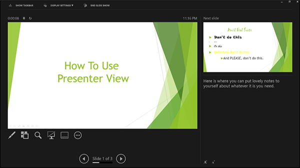
PowerPoint’s presenter view lets you see the final slides PLUS presenter notes.
If PowerPoint doesn’t prompt you to select Presenter View when you start your slideshow, you can find the option in the “SlideShow” tab. To find it after you’ve begun the slideshow, look for 3 dots below the main slide view—you can click on them to bring it up.
Use Presenter View to write notes to yourself. This is how you can avoid using your slides as index cards. Add prompts, tips on movements or gestures, or specific stats and numbers that you didn’t want to include on your slide.
Meanwhile, your audience just sees the slides flowing seamlessly, and you look like a genius, pulling stats and figures seemingly from thin air.
Pull up the appropriate slide if someone asks a question. In many cases, questions relate to one of the slides in your presentation. When that happens, find the slide in Presenter View before you put it on the screen—rather than forcing your audience to watch as you flip through the entire stack.
Final Thoughts
PowerPoint can be your best friend or your worst enemy. So many people use it badly that it’s almost synonymous with boring.
In fact, there’s even a political party focused on removing PowerPoint from business presentations.
But it doesn’t have to be that way.
With a little thought and time, you can make effective PowerPoint presentations that grab your audience’s attention.
Make PowerPoint your friend: Keep it simple. Keep it focused. Keep it visual. And people will be excited that you’re the one giving the next presentation.
(NOTE: Need a helping hand with your digital marketing efforts? Or maybe you just want proven, actionable marketing tools, tactics, and templates to implement in your business? Check out the latest deal from DigitalMarketer, and you will be on your way to helping your business grow.)
The post 7 PowerPoint Tips to Banish Boring Presentations appeared first on DigitalMarketer.
from 7 PowerPoint Tips to Banish Boring Presentations

No comments:
Post a Comment